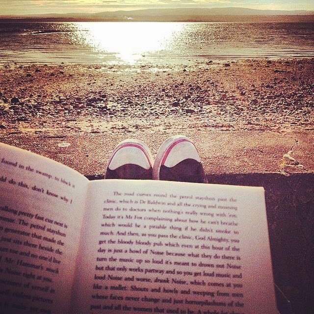
Favourite reading spot
When the weather is nice, I like to take a cup of coffee and my book and wonder down to the end of my street where there is a nice bench and a handy wall and the sea. And don't think for a minute I don't know how lucky I am...
Best Cover
I couldn't choose. But at the moment I like these. In fact, a lot of the covers that I like involve red, black and white. You can find ten of my favourites here.
Worst Cover
I mean, FOR THE LOVE OF GOD. Just before the release of the final book in this series, I was sent the first five and challenged by a publicist to read and review them in two weeks. I did. But I didn't bloody read them in public. Everything about this cover is wrong; the colours, the composition and most of all the MASSIVE FACES. I hate faces on covers - I feel like it robs me of the chance to see the characters in my head as I learn what they look like. But, in this case, that is beside the point as it is shit on a hundred different levels. Since release, the VA books have all had cover re-designs and now look a lot more palatable. Which is good, as they are actually a lot of fun and now you can have fun reading them in front of people, too.


Comments